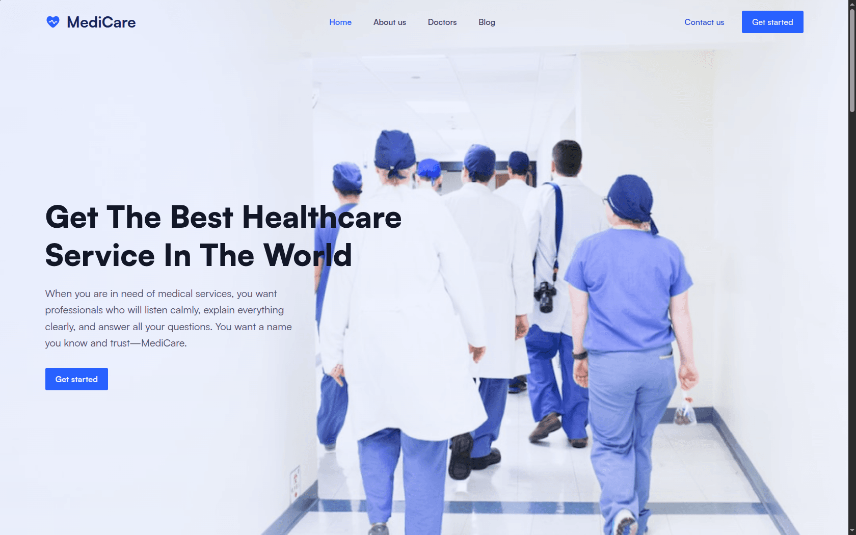
The problem
Healthcare sites tend to be written for the institution. Mission statement, accreditations, a message from the director, and somewhere past all of it, the two things the patient actually arrived for: can you treat this, and how do I get seen.
MediCare covers six specialties across multiple locations, plus virtual consultation. All of it has to be legible to someone who is probably worried and definitely not browsing.
The constraint
A front door, not a hospital system
The build is frontend only. Consultations, records and scheduling all live in systems the clinic already runs, and none of them were being replaced.
That sets the job precisely: every path through the site ends in a handoff. The work is getting someone to the right handoff quickly and telling them what to expect on the other side, not implementing the thing they are being handed to.
What I built
- 01
Specialties are the navigation
People arrive knowing a symptom or a department, not a service tier. Prosthetics, gynaecology, cardiology, radiology, dentistry and neurology sit at the top level rather than nested inside a generic Services page.
- 02
Telemedicine as an equal option, not an alternative
Virtual consultation is presented alongside in-person from the first screen. Treating remote care as a fallback buried further down tells the visitor it is the lesser option, which is the wrong message for the people most likely to need it.
- 03
Free consultation and 24/7 stated up front
The two facts most likely to turn hesitation into a booking are the two most often buried in a footer. Both are surfaced where the decision is actually being made.